To read these words, you likely typed a web address into your browser, scrolled through your newsfeed, and clicked on this article. It doesn’t take much, does it? A simple click of the mouse gives you access to a wealth of information. Yet, for some, communications aren’t easily available.
Accessibility – the design of products, services, and environments for people who experience disabilities – is often an afterthought. However, a universal design that caters to both those with disabilities and those without is probably easier than you think.
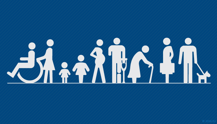
Knowing and defining your audience is one of the first steps in any successful communications project. You may be thinking, “My audience isn’t disabled,” but you’d be wrong. Have you ever known someone with hearing loss? Color blindness? Arthritis? Dyslexia? These common impairments are just the tip of the iceberg. If that doesn’t convince you, just remember that there’s legislation that requires communications to be accessible to everyone.
Let’s break disabilities down into four main categories: visual, auditory, motor, and cognitive. By understanding common struggles, we can make our communications easier to understand.
Visual
Vision loss includes problems with your central vision, peripheral vision, contrast sensitivity, depth perception, and visual processing. Screen readers – devices/software that read text out loud – are a common solution. Text-to-speech can be enabled on most computers, tablets, and phones; try testing out how your communications work with these readers. To make communications more accessible for people with visual problems:
Use styles when writing and designing. For example, if creating a web page in HTML, use H1 (first-level heading), H2 (second-level heading), and paragraph tags instead of overriding styles manually. Make sure that the headings provide apt descriptions of the content. This makes it easier to skim through headings instead of forcing your audience to listen to every word on the page.
Add alt text to graphics (when necessary). If a graphic has ever failed to load and you saw text in its place, you’ve seen alt text. The text should be descriptive enough to convey the same information as the graphic itself. Sometimes the alt text should be left blank (such as when the graphic is decorative or the equivalent is already available in text format).
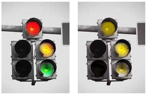
Choose contrasting colors that are easy for everyone to distinguish. Red-green color blindness makes it difficult to distinguish between reds and greens. According to the National Eye Institute, approximately 8% of men and 0.5% of women of European ancestry are red-green colorblind[1].

Auditory
Hearing impairments make it difficult for people to listen to videos, podcasts, and other auditory communications. According to a 2011 Johns Hopkins study, about 20% of Americans have some degree of hearing loss so severe that it may make communication difficult.[2] By the age of 65, a third of people have hearing loss. By 75, half of people have trouble hearing.[3] These are not insignificant figures. Luckily, it’s not difficult to include this group of people:
Create transcripts or captions to let people consume content even if they can’t hear it. Transcripts and captions are also helpful for people who can’t listen to content simply because they are in a loud environment (for example, a busy social gathering) or need to stay quiet (working in a library).

Provide hearing aids or sign language interpreters at live events. This helps people interact in real time.
Motor
Arthritis, muscular dystrophy, ALS, and other motor disabilities limit the way users interact with devices. 15.1% of U.S. adults have some kind of physical functioning difficulty.[4] Since navigation can be difficult for this group of people:
Provide on-screen options for people who can’t turn physical pages.
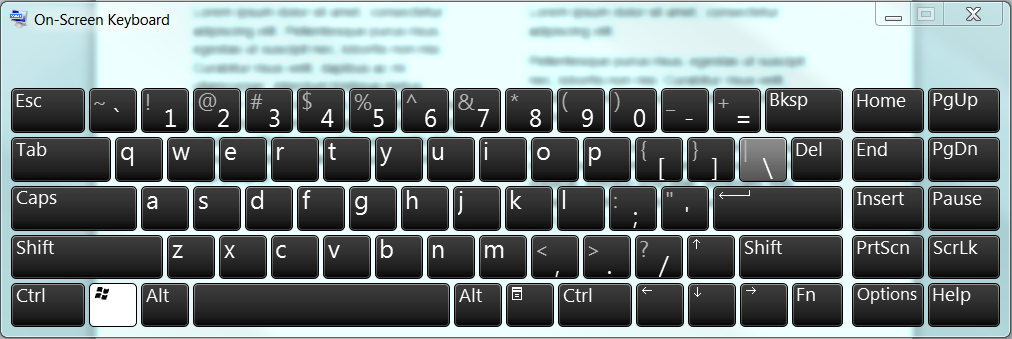
Create digital communications that don’t require a mouse. Many people without fine motor control navigate using a keyboard. This also lets people use keyboard-mimicking technology for input.

Cognitive
Functional problems for cognitive disabilities include attention, comprehension, memory, and problem-solving issues. ADHD, autism, and dyslexia fall into this category. To help accommodate people with cognitive disabilities:
Reduce distractions. Popups or flashing graphics might make it difficult to focus.
Write shorter paragraphs. If a wall of text can be difficult for people without a cognitive impairment, imagine how much worse they are for someone with dyslexia.

Create graphics. Graphics can be better than text when your audience has shorter attention spans or processes information at a slower pace. They’re also helpful for people who have difficulty with reading comprehension.
You’ll notice that these tips aren’t exclusively for people with disabilities. That’s the beautiful part: accessibility creates better experiences for everyone. So, if you only remember one thing, remember this: Your audience is disabled. They are your parents, children, friends, neighbors, coworkers, and that guy you stood behind in line yesterday. Impairments are not the exception to the rule. And, when you design with accessibility in mind, everyone wins.
https://nei.nih.gov/health/color_blindness/facts_about
http://www.hopkinsmedicine.org/news/media/releases/one_in_five_americans_has_hearing_loss
https://www.nidcd.nih.gov/health/age-related-hearing-loss
http://www.cdc.gov/nchs/fastats/disability.htm


